


Barbara Owen Explores Memory, Femininity, and Landscape Through Color and Form in Her Poetic ‘Portals’ Series

Barbara Owen’s Deep Engagement with Goethe and Albers’ Theories
Barbara Owen discusses her artistic journey, from exploring colour theory to creating emotionally resonant abstract works that intertwine personal memories, landscape, femininity, and the shifting boundaries between the internal and external world.
Barbara Owen’s work stands as a testament to the power of abstraction in expressing the complexities of memory, identity, and perception. A versatile artist based between Pawtucket, Rhode Island and Brooklyn, New York, Owen has garnered widespread recognition for her deep engagement with colour theory and her exploration of landscape, femininity, and beauty. Her works have been featured in prestigious publications such as “ArtScope Magazine”, “Studio Visit”, and the “Art in Embassies Collection Catalogue”. With a background in both visual art and poetry, Owen’s paintings resonate with a poetic quality, weaving together visual elements and emotional depth in ways that engage both the intellect and the senses.
Her approach to art is rooted in an intimate understanding of colour’s power to evoke memory and feeling, drawing inspiration from influential colour theorists like Johann Wolfgang von Goethe and Josef Albers. Through her use of colour and form, Owen creates abstract compositions that reflect personal landscapes—both physical and psychological—infused with the rich textures of her experiences. The “Portals” series, for example, introduces geometric and organic shapes that serve as metaphors for windows, bodies, and spaces of transformation. Each painting invites the viewer to look deeper, to experience the intersection of emotional resonance and visual beauty. With every stroke, Owen crafts a space for dialogue between the viewer and the work, drawing on her profound understanding of colour’s emotional and psychological impact.
“We never look at just one thing; we are always looking at the relation between things and ourselves.” -John Berger, Ways of Seeing
Can you discuss the influence of colour theorists like Joseph Albers and Johann Wolfgang von Goethe on your work, particularly in the context of your newest series, “Portals”?
My interest in colour theory began when I learned that by using specific colour palettes, I could create a successful painting. During this process, I also started to notice and refine my preferences. I discovered that colour is deeply personal; certain colours and combinations resonate with memories and experiences, making colour an essential aspect of my artistic practice.
I relate to Goethe’s writings on colour because his perspective as a poet, philosopher, and artist is experiential rather than scientific. Both Goethe and Albers discuss the subjective experience of colour and its emotional and psychological significance—how colours can affect our feelings and mood.
Goethe’s influence on Albers is notable for being the first to address the phenomenon of simultaneous contrast. This phenomenon describes how colours can appear to change when placed next to one another. For example, a red square on a blue background will seem brighter than the same red square on a green background. Albers concentrated on this concept in his own work and teachings.
Interestingly, the Portals have become reflections of that interest. While they may not be visually tricky, I find inspiration and gain insight from examining the colour combinations Albers used in his Ode to the Square series.
I love this quote from section IV of Albers Interaction of Colour: “Thus, continuing comparison ~observation ~ thinking in situations ~ is promoted, making the class aware that discovery and invention are the criteria of creativeness.”
How do the themes of landscape, femininity, and beauty manifest in your abstract paintings, and what emotions do you hope to evoke through these themes?
The foundation of my work is built on those three themes.
In your earlier question about the influence of colour theory, I said that colours can summon memories. Growing up in Maine, I spent a lot of time outside in all seasons. Hiking in dense viridian forests, swimming in lakes and rivers every shade of blue, skiing in crusted milky silver snow- all memories of a landscape with me in it. I feel the best when I am in these places. The challenge is to somehow translate the feeling of breathtaking beauty and happiness into my work – the only way I know how to do that is with colour.
With colour and materials, I challenge myself by exploring the ways landscapes can be symbolized. This representation can be simple or complex. For example, a soft, hazy blend of light blue with touches of pink and yellow against a midnight blue background would read as a landscape. If the surface is three-dimensional shape -instead of a flat canvas- it could suggest the shape of a body, as the maker, it would inevitably represent my body.
Alternatively, art can also be perceived as an inner landscape—a psychological space uniquely created by the viewer when experiencing the artwork. This subjective space is one that I may not have complete control over, but it is precisely in this territory that I investigate.
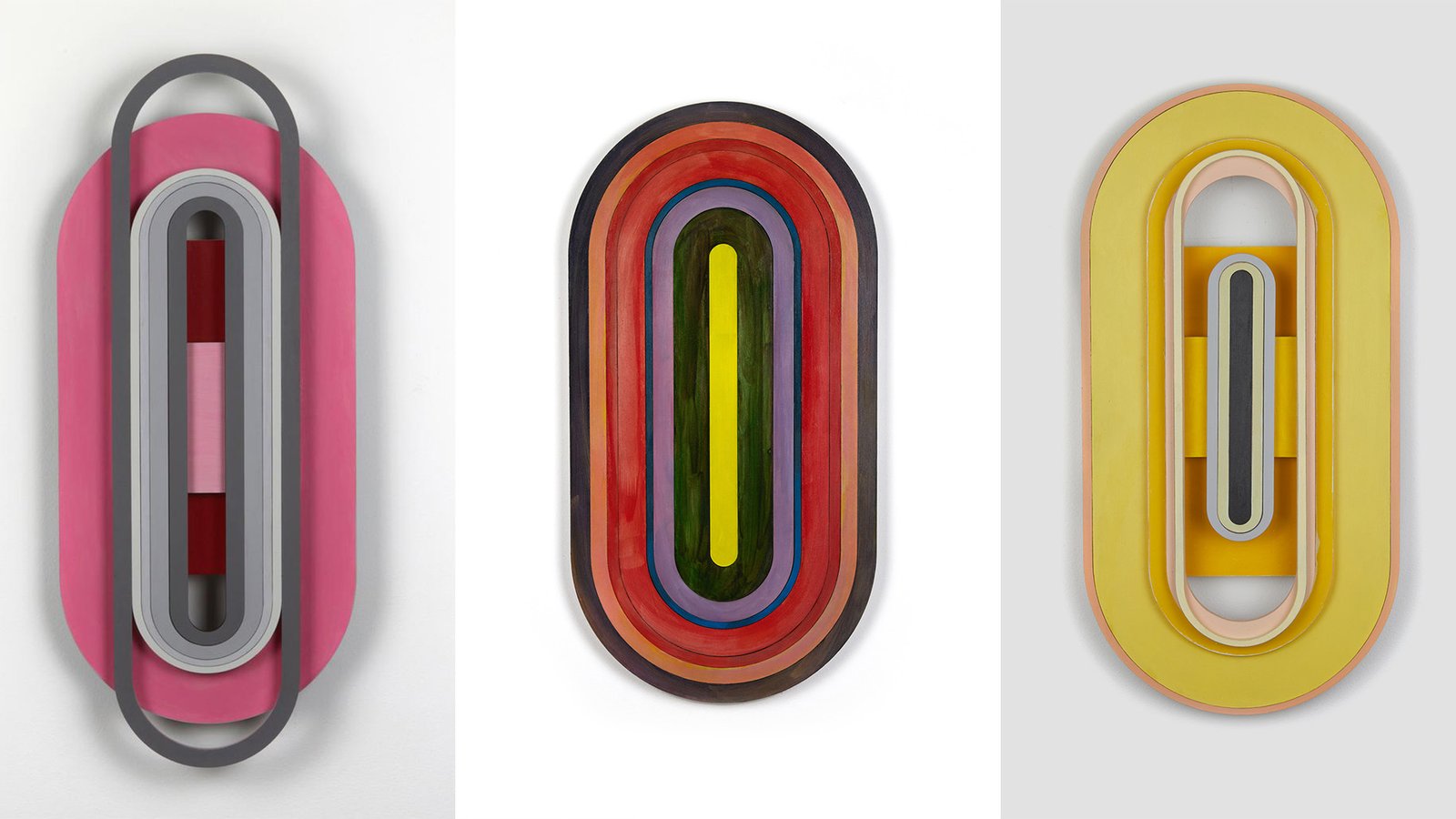
What inspired the shapes you are creating for the “Portals”?
It began when exploring geometric shapes that I could paint on. Until that point, I had been constructing shaped surfaces with rounded edges that resembled windows. The metaphors that the shape of a window could convey, such as the idea of looking in or looking out, interested me.
At some point, the shape became oblong, echoing an earlier series in cut paper called “necklaces,” where an initial shape is cut and contoured until it becomes too small to exist. One day, I cut an oblong shape and saw this time that its yonic reference resonated beautifully with the concept of a female body in a space. It also preserved the metaphor of a window or a portal. I realized that the colour could interact with the shapes in a way that either draws the viewer’s eye in or pushes it away. And so, the series began.
In creating the Portals, you experienced a shift from aiming for a smooth paint application to revealing more of your hand as a painter. What prompted this change, and how has it affected your artistic process?
Applying paint smoothly leaves no room for gesture or action; it’s something anyone could do—perhaps even a machine. In contrast, when there is texture and visible brushstrokes, the work becomes undeniably personal and expressive. However, and this is significant for me, a smooth paint application prioritizes formal elements such as colour, shape, and composition.
I don’t think I will drop one for the other but be discerning how and when to shift between the two ways of applying paint. Each method contributes differently to the meaning of the artwork.
EDITOR’S HIGHLIGHTS
Empowering Art & Artists Globally
“Being featured in WOWwART means gaining visibility not just in print edition, but across the entire media spectrum in the US, UK, Europe and beyond”

EDITOR’S HIGHLIGHTS
Media, Art and Artist
Media is a powerful tool to build relationships, boost visibility, influence decisions, and create lasting impressions for success and growth.